What exactly is a ‘Siberian Khatru’?

Roger Dean

Illustrations inspiring a generation

The year is 1974 and I am in the art classroom of my high school, a stuffy, all boys catholic affair, Archbishop Carroll HS for Boys. Boys! Are we not men?

Our side of the building is immense, nuzzling against the adjacent girl’s school, taunting us, as if to say, “you will never get this close to the girls”, unless of course you are prepared to endure the ear splitting silence of the library or the pious solitude of the chapel. Here at ABC the aggregate knowledge of the ages conspires to contain our hormonal bodies, separate and miserable.

With the girls out of reach, we turned to art and music.

Denny Farrell, a fast friend and rabid music enthusiast has smuggled some contraband into the art room. We huddle around, sheltering it from view as the teacher is momentarily occupied. The object of our attention, an album cover, a rock album cover, transforming an egregious violation into a capital offence should we be caught.

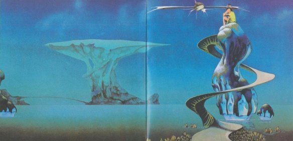
YES SONGS was the name of the album and Yes the name of the band and although we marveled at the intelligence and virtuosity of the music we were just as taken with the cover art and competed to find any hidden items concealed within the painting’s composition.

Now might be a good time for some musical accompaniment.

A ruminate interjection:

An album or ’33s for those too old to care or too young to reminisce, is simply the vehicle of recording popular music that involved a grooved rotating vinyl disc surrendering its recorded sound via a diamond tipped stylus craning from a spinning turntable. This system superseded the much chunkier and faster spinning ’78s (RPMs) and preceded the more compact but problematic cassette tapes just beginning to hit the streets. Nothing portable here.

This “jacket” as it was known was far more than a single sleeve to hold the black vinyl disk. The LP or Long Playing Record contained within Yessongs was in fact a 3 disc set of live recordings surrounded by a booklet style of covering, reproductions of artwork on all sides, and what amazing paintings they were, each depicting figurative themes relating to the songs.

                                                                                                                                                                   Inside Artwork from Yessongs     They don’t make em like this anymore

It’s hard to remember weather one purchased the album for the artistic exterior or the art within. A bit of both I suppose and even if the music was rubbish you still had those amazing paintings to take you on a journey.

Roger Dean is that type of artist. One to grab you with a striking composition and then mesmerize with the kind of detail a generation craved, detail rich in color and texture, embellishing the landscapes and creatures within. Detail that permits us to wander off the path, and follow the artist through his imaginations of floating islands, winged flying things and human characters, alone but never lonely.

Artist and Innovator Roger Dean

Born during the waning years of WWII, in Ashford, Kent, UK the young Roger Dean grew up everywhere but, while the family moved around the world with his army father. Roger Dean showed promise as an artist early in life and after returning to England in 1956 completed secondary education at The Norton Knatchbull School. He earned a national diploma from the Canterbury School of Art and in 1968 graduated from the Royal College of Art London. While at the Canterbury School the young Dean designed the ‘Sea Urchin Chair’ the predecessor to the “bean bag” chair, which he later constructed while finalizing a degree at the Royal College.  It was here he designed his first house, his own.

It was in this period a driven Roger Dean was absorbed into the world of music as an artist and painter who could convey the sense of freedom and fantasy so popular in the music of the time.


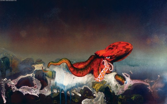
Gentle Giant Octopus Cover

Dean’s cover art became a powerful marketing tool even propping up some lesser musical offerings and boosting album sales of smaller, independent labels. Dean’s work for “super groups” such as Asia, Yes and Gentle Giant proved a steady stream of income over the years. Dean created for all genres of musical taste from the psychedelic to the philharmonic. Roger Dean is credited with over 100 album covers and more recently these works have found a new market as limited edition prints and collector pieces with signed editions selling for tens of thousands of dollars.

Virgin Records Logo     Gone are the days when a logo could be complicated and rich.


Over the decades Dean has been forever true to his fantastic origins, so with an interest in design and architecture and a concern for truly livable spaces Dean endeavors to design new and exciting habitats for our living spaces. He is currently occupied with a few design and architectural projects aptly called Willowater and Home for Life.

These homes would be just the type of place my old mate Denny would love. I can almost hear our favorite song ‘Siberian Khatru’ pulsing from the organically shaped openings in the three dimensional version of a Roger Dean cover.


The Sea Urchin Chair (The Grandfather of the beanbag chair)

Resources for Roger Dean and his Art

http://www.johncoulthart.com/feuilleton/2010/01/24/roger-dean-artist-and- designer/

http://www.thedailyswarm.com/headlines/did-yes-cover-artist-inspire-avatars- moons/

www.rogerdean.com/

www.artcyclopedia.com/artists/dean_roger.html

www.sci-fi-o-rama.com/category/artist/roger-dean/

www.vads.ac.uk/x-large.php?uid=158932&sos=0   This is the link to the Royal College of Art’s photographic archive of student artwork

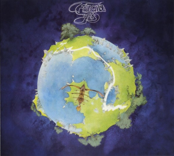
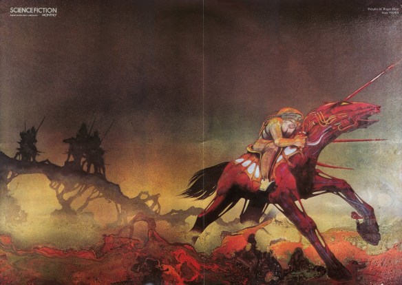
The ‘Fragile’ Cover          So ahead of their time.


PALADIN


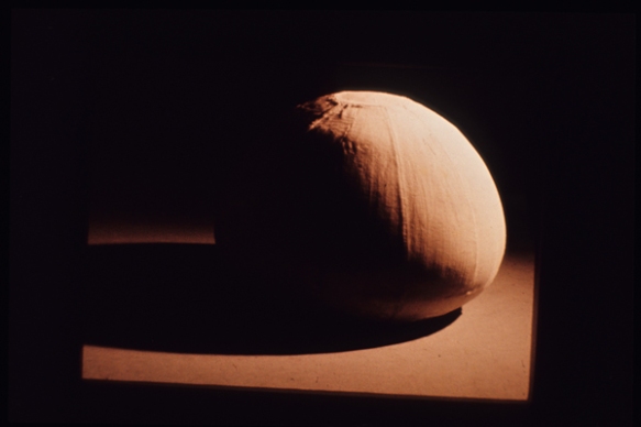
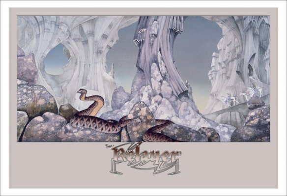
The ‘Relayer’ Cover

Will someone, anyone please take a decent photograph of this photographer?

Finding Richard Burbridge

OK, Here’s something that really chaffs my ass.

In researching a photographer for this, a blog in my design history class, it has come as a  tremendous shock to me that there are no good photographs of this guy. I know, I know, this isn’t just a guy, it’s Richard Fu@$ing Burbridge, arguably one of the cleverest and uninhibited photographic talents of our era. All the more frustrating that anywhere on the net there seems to be only two miserable images available. Heres one.


Burbridge, a man of privacy?

Now I’m well aware that my instructor is more looking for examples of Burbridge’s work, I get it, and there are countless amazing images ripped from the pages of  i-D, Self Service, Another, Vogue Italia, and Harpers Bazaar. That should be the hardest part of this task, deciding from the myriad exposures of sultry and sullen, overdressed and undressed models of all description, which photos best exemplify the Burbridge ethos.

Alas the real challenge for this poor schmuck of a blogger seems to be putting my cursor on any decent snaps of the artist himself.

I guess it’s a bit like the plumber’s home having leaky taps, or the accountant, behind on his taxes. I mean, don’t artists still check in with a self portrait every now and again. Touch base with the psyche and all that.

Surely in the midst of the digital photographic maelstrom that is New York City or Paris or Milan, someone could yank out a zircon encrusted i-Phone and surreptitiously snap one or two. Christ, no one would notice the pathetic little blink of a mobile phone flash through their bloodshot and strobe blind eyes.

Ah, then there is this train of thought.

Perhaps, Richard Burbridge is just the type to resist all of the meaningless trappings and bumptious egotism that tends to overwhelm the modern fashion universe. After all, working with clients like Hermes, Givenchy, and Louis Vuitton can tend to have an uppity influence on one’s self, if not careful. Living life large amidst the worlds most beautiful beings swaddled in the finest couture prepared by venerated designers all while sipping champagne with an unpronounceable foreign name has ruined lesser men.

So this is my theory and I’m sticking with it. Richard Burbridge, a seemingly unassuming ‘Brit’ with racks of imagination and endless focus just refuses to get caught up in the whirlwind in which he makes his living as a creative and a photographer.

I like that.

But, I could be wrong, so as I squeeze along Fifth Avenue and carefully step around that fusty, god forsaken bloke sleeping under yesterday’s copy of the Times, I’m gonna look to see if there’s a Canon 1D tethered to his unshaven neck and a leaking, near empty bottle of Louis Roederer’s Cristal just beside him.


One of the many Burbridge covers


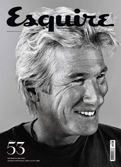
Gere looking Fabulous


Burbridge does a lot of covers


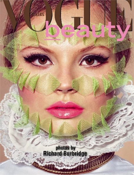
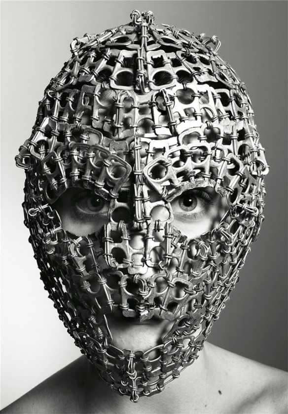
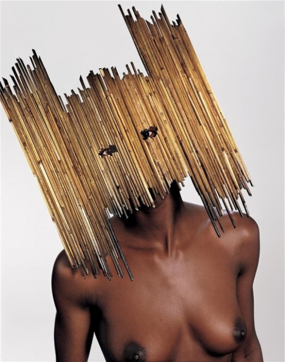
Part of a wonderful mask series


Could this be Burbridge behind the mask?

Resources for Richard Burbridge

http://trendland.com/richard-burbridge/#

http://i-donline.com/authors/richard-burbridge/

http://models.com/feed/?tag=richard-burbridge

http://fashiongonerogue.com/photographer/richard-burbridge-photographer/

http://www.artandcommerce.com/AAC/C.aspx?

Drawing on experience

Gemma O’Brien    Designer of all things type


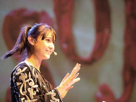
At TYPO Berlin

When my daughter was small, I’m talking 18 months, when most children are adjusting to bipedal life and regurgitating a few cleverly mimicked words as well as their strained peas, my little girl taught herself to draw. She started on the wall at the bottom of the living room steps and permanently markered her way up to the landing, scribing all manner of letters and scribble before I abbreviated her young career and plucked her off the stairs.

This is how I imagine the young designer named Gemma O’Brien would have started out.

I mean it just makes sense. Here is a young woman who has completely dunked herself into a passion for drawing and creating, particularly letters, numbers and all forms of type.


Pages of a sketchbook

Gemma is a self proclaimed type geek who is talented enough to see her designs published in print, television, online and in the flesh, well actually, on the flesh.

While working on a brief for her Design BA at The University of New South Wales, College of Fine Arts (CoFA) Gemma presented a particular community problem, Graffiti, the destruction of other’s property. She decided to use her own body to represent the public’s urge and instinct to express itself with too few outlets available.

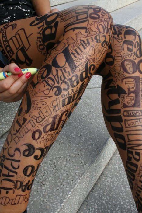
The artist spent an entire day drawing text on her body, head to toe, with permanent markers as the video camera followed her to different locations during the process. No typo’s here. After 8 hours of writing, 5 texters, 3 showers and 2 baths the world now knows what Gemma O’Brien is all about. The resulting You Tube post has over 350,000 views to date.

Write here right now

This picture really is worth a thousand words.

Her body isn’t the only platform she has for expressing her views. Gemma has been asked to present at conferences such as TYPO Berlin in 2009 where she was the youngest speaker in the conference’s history, and in 2011 at Australia’s Semi Permanent in Brisbane, Sydney and Perth.

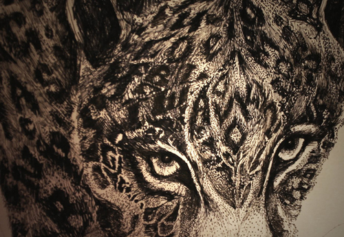
Bourges Jaguar

Being a type geek Gemma has interjected herself and her work into the world through social media outlets as well. She has adopted the name Mrs Eaves and maintains a blog of her thoughts, work and travel in, For the Love of Type
Gemma’s work is inspired by artists and statements she admires. Stefan Sagmeister and his text on body statements and from an illustrative perspective she praises the lettering work of Si Scott.
Over the past few years she has created work for a growing list of cracking clients like Smirnoff ,The New York Times, ABC3, Canon, and recording artist Julia Stone.

Emma has recently redesigned the banner for the magazine Peppermint. Shows work in a variety of galleries and shops and has collected paychecks from some of Australia’s most celebrated creative agencies, Toby and Pete, Animal Logic and Leo Burnett.


Peppermint banner redesign

Obviously with a background like this, Gemma O’Brien, this effervescent, type obsessed, 20 something of a designer will forever more be able to draw on experiences rather than just drawing on herself.

Resources for Gemma O’Brien

http://www.fortheloveoftype.blogspot.com.au

http://www.dhub.org/letter-love-with-gemma-obrien/

http://www.australianedge.net/design/for-the-love-of-type-with-mrs-eaves/

www.lettercult.com/archives/82

www.youtube.com/watch?v=mX2NnwUDrB8

“The Hidden Beautiful”

Illustrator Gary Fernandez

Gary Fernandez illustrator


Having a knack for exploring the mundane and coming out the other side with fantastic and surrealistic renderings, illustrator Gary Fernandez has certainly made the most of his time in the spotlight. With super brands Coca Cola and Nokia notched on his commercial belt Gary has drawn, painted and mentored his way to the top of a highly competitive industry and all the while maintaining his boyish charm and endearing humility.


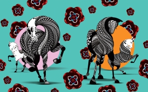
Wild Horses


Born in Madrid, Spain in 1980 Gary Fernandez now calls Vancouver, British Columbia home base but is traveling regularly between Asia, Europe and the US to spread his illustrative message.

Gary started drawing when he was a young boy and never looked back, gaining a true appreciation for illustration and design while contributing to the design team for the Spanish pop culture magazine Vanidad (Vanity) in 03 and 04. It was here that he combined the pieces of the illustrative style he now uses to delight and confound the art and design world.

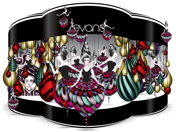
Sticking to simple but obscure colour pallets has become a trademark of the Fernandez style, in part, a love of certain colours and as much a way to simplify often very intricate and complex drawings.Drawn toward the human figure as a focal point in his art made for a subtle crossover into fashion illustration finding heavyweights Dolce and Gabbana and UK retail giant Evans clamouring for more.

Evans Promotion

Fernandez, for all of the simplicity he aspires seems to be a very complex and thoughtful artist. Rooted deep in his Spanish heritage Fernandez cites examples from personalities and Spanish artists like Antoni Gaudí and Salvador Dali as inspiration for the flowing compositions and liquid shapes and forms he creates.

Like the great and eccentric artists who preceded him, Fernandez has also self published a book of his work, not so simply entitled “Introduction to Fantastic Girls, Future Landscapes & The Most Beautiful Birds Ever Seen”. Praised by critics as a modern classic for its intensity and flowing beauty.

Dog Park


Always conscious of his audience, Fernandez has embarked on a new venture creating art for tee shirts under the banner of ‘Velvet Banana’. Whilst this departure will see his creations produced en mass, he still revels in the glow of affection showered upon him by the countless young artists he has inspired and mentored through his ongoing lectures and collaborative workshop series.


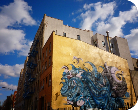
These workshops often culminate in pieces of public art or murals finished entirely by his students, no doubt leaving an indelible impression on young illustrators and their vision of “the hidden beautiful”.

East Village Mural NYC

Resources for Gary Fernandez

http://www.hypocritedesign.com/gary-fernandez/

www.thecoolhunter.net/article/detail/1368/gary-fernandez

 www.swide.com/luxury-magazine/Faces/Artists/a-la-mode/2011/7/23

http://www.youtube.com/watch?v=QgHlSLwq3oM

thefewgallery.com/artists/5


Don’t go anywhere without a poo bag.

Designer    Sagi Haviv

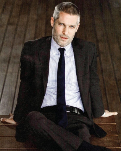
Looking at photos of Sagi Haviv, it strikes me just how much his looks resemble a logo. Clean, chiseled, a frosting of grey hinting at wisdom that belies his 38 years. And those eyes, cool, bright blue, a graphic statement if I ever saw one.

How fitting for a young man who has wowed the design world with his intuition and resolve to get to the crux of an image. The New Yorker Magazine referred to him as a “logo prodigy”. No wonder, with high profile logo clients like Armani Exchange, The Library of Congress and the International Tchaikovsky Competition, Haviv’s influence will be indelibly etched on the face of modern culture for some time.

International Tchaikovsky Competition

Born in Israel, Sagi Haviv studied at the art high school, Telma Yelin in Givataim. A move to New York in 1996 and a Bachelor of Fine Arts from Cooper Union and presto, a design career originating at one of the premier agencies in the world, Chermayeff & Geisner. A “wunderkind” proclaimed OUT Magazine.

Haviv wasted no time and in 2003 created a clever and groundbreaking way to showcase the firm’s designs. “Logomotion” is a 10 minute motion graphic sequence seamlessly morphing the last graphic into the next. The scope and delivery of this project has won he and his firm numerous awards like the Tokyo Type Directors Club Award and an award from the New York Art Directors Club.

Logo for the Balloon Museum

Sagi Haviv’s talent in motion graphics has secured him some amasing clients and projects. He is responsible for the main titles of the Emmy winning PBS docos “Carrier” and “Circus”. In 2009 he created the typographic animation for Alicia Keys’ centerpiece performance at the pop star’s Black Ball “Keep the Children Alive” fundraiser.

The New Library Of Congress Logo

He has redesigned the logo for the United States Library of Congress. What this means is that this logo, his work, will appear on the spines of tens of millions of books and publications catalogued at the library. Talk about posterity.

Here is a link to a gorgeous  animated logo driven by Sagi Haviv at Chermayeff & Geisner for Conservation International and is an example of how Haviv has blurred the line between static logo treatments and dynamic animated graphics and titles.


Haviv teaches Corporate Identity Design at The School of Visual Arts in New York city. He has studied at Lee Strasberg’s famous acting school, brings his chocolate labrador “Neo” to work with him and really enjoys plunking himself down on his Italian leather sectional to watch re-runs of “Battlestar Galactica”.

No kidding, he’s just a regular guy, an impeccably dressed regular guy who just happens to be influencing popular culture across the globe with his brilliant identity work and groundbreaking graphics, with time still left to tidy up the odd droppings his dog leaves behind.

Go Sagi Haviv.

Sagi Haviv resources

http://www.logodesignlove.com/sagi-haviv-interview

http://www.gdusa.com/issue_2009/01_jan/ptw/p19.php

http://www.underconsideration.com/brandnew/archives/ the_librabry_of_congress_gets_its_wings.php

Library of Congress logo animation  http://vimeo.com/10262031

wikipedia.org/wiki/Sagi_Haviv

What does the fashion industry and the MIR space station have in common ?

Paco Rabanne

As it sometimes happens when telling a story, you occasionally feel the need to preface certain statements with the words, “This is where it gets weird”.
I recon I should preface Paco Rabanne’s bio with “This is where it gets weird”
I mean c’mon, the poor kid, born Fransisco Rabeneda y Cuervo in 1934, grew up in the tumultuous era of the Spanish Civil War.
 
The boy found himself caught between a grandmother, who by all accounts, was consumed by religious fervour and as a possessor of traditional natural healing secrets practised the occult sciences and his mother, a devout atheist and an important figure in the Spanish socialist party was also the chief seamstress at the Spanish salon of Balenciaga, a renowned designer and manufacturer of fashion and accessories. His father might have been a stabilising influence had he not been killed for not renouncing his republican beliefs. A normal life was not to be for young “Paco”
The family fled Spain and settled in France where Paco learned the tolerance, openness and generosity, hallmarks of his familial influences, which would carry him through life.
Trained as an architect at the Ecole Nationale des Beaux-Arts, Paco was encouraged to experience the “culture of his time”, through film and theatre, art, literature and intellectuals. He was taught to explore what made these times special and create expressions in his work.
Paco was a crafty one as he worked out how to finance his education by producing fashion accessories, obviously a credit to his mother and to her work with Balenciaga. He designed and manufactured handbags, jewellery and belts for the famous designers of his time; Cristobal Balenciaga, Hubert de Givenchy, Christian Dior, Yves Saint Laurent. Sometimes it’s both, what you know and who you know.
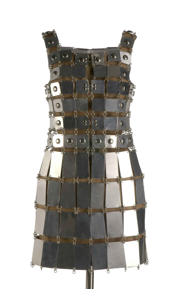
In the late 1950’s and early “60’s the arts were transforming under the weight of a heavy modernist movement and finding that specialness,  Paco Rabanne expressed “his time” through some of the most famous and infamous statements ever produced. In 1965 he launched his career as a fashion designer by creating a collection of 12 outrageous dresses which he called “the Unwearables”, these twelve experimental dresses were produced in contemporary materials, metal, plastic and leather early in the following year. Also in 1966, Paco Rabanne created paper dresses, for day and evening wear, which were sold in small bags. Disposable clothing was born. Leaving nothing to chance in this most important year, Paco opened his first outlet and at the age of 32 his linked metal and plastic-disc dresses earned him international success while the fashion elite branded him “L’Enfant terrible”. Awesome!
Some other firsts for this innovator and fashion shit stirror.
1967    –  Moulded clothing
1968    –  Knitted fur and also ”the aluminium jersey”
1970’s –  black women as fashion models
One of my favourite Rabanne outfits is the costume for Jane Fonda in the science-fiction film “Barbarella” in 1968 and although I didn’t see the movie until its release on video tape years later, I did manage to hide the movie poster in my closet for some time.
 Rabanne went on to design costumes for a number of films and had tremendous success with his lines of perfume, worn by the most glamorous women of the time; Elizabeth Taylor, Audrey Hepburn, Brigitte Bardot and Kay Mashett.
 
In 1993 Rabanne wrote a book, “Le Fin de Temps” in which he predicts that the MIR space station will crash into Paris and just wreck the place. He was mocked and ostracised for his predictions and when asked what happened he replied, ”My timing was off”.
In 1999, Paco Rabanne presented his final collection and retired. He remains connected to the brand and the” look” while he preaches his own brand of philosophy.
 Nowadays, Paco Rabanne lives a bit like a monk with no car, no real possession and no swanky Fifth Avenue apartment. Paco prefers to spend his money on a hospice run by monks somewhere in the middle of France and his time puttering about, somewhere, for obvious reasons, far from Paris.

Bibliography

Style; Man of Steel http://www.nytimes.com/2002/03/10/magazine/style-man-of-steel.html?pagewanted=all&src=pm  By Lisa Eisner and Roman Alonso, March 10, 2002

http://www.designerindex.net/designers/pacorabanne.html

http://www.fashionmodeldirectory.com/designers/paco-rabanne/
http://www.pacorabanne.com

Erté. Imagine creating for 10 decades.

Born, November 23,1892 in St Petersburg, the only son of an admiral in Russia’s Imperial Fleet, Romaine de Tirtoff was raised amongst Russia’s social elite. As a young boy, he was fascinated by the brightly coloured patterns of the Persian miniatures his father collected. These would inspire Romaine throughout his life.
Showing early indications of genius, the young designer began his fashion career at the age of six, when his mother had a dress made from one his first sketches.
Moving to Paris at the age of eighteen, de Tirtoff rebadged himself Erté, from the French pronunciation of his initials, R and T. While in Paris he collaborated with famed Parisian couturier Paul Poiret and on occasion he even modeled his own dress designs. He developed a passion for costume design while selling his gouache and pen-and-ink illustrations to American fashion houses.

World War I stymied many of the great fashion houses in Europe and Erté soon began what became a 22-year relationship with the chic fashion journal Harper’s Bazaar as a fashion illustrator.

His first cover for Harpers was published in January of 1915. For over two decades his flamboyant and elaborately illustrated designs graced the covers (250 in all) while countless drawings filled the inner leaves. He was also an esteemed contributor to Cosmopolitan, Ladies Home Journal and Vogue.

For 35 years he designed elaborately structured opening tableaus, finale scenes, and costumes for the French theatre. He worked for the Folies-Bergère in Paris from 1919 to 1930. During the 1920s he dressed the performers appearing in American musical revues such as the “Ziegfeld Follies” and George White’s “Scandals”.

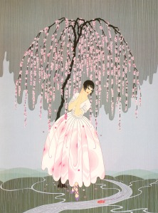
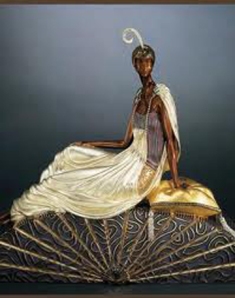
After a period of relative obscurity in the 1940s and 1950s, Erté’s flamboyant style found a new and enthusiastic market in the 1960s, and at the age of 75, Erté was encouraged to begin a new career and revisit the breathtaking designs of his youth in bronze and serigraphy, a fine art silk screen process. Having the foresight to retain many of his original drawings and paintings, Erté found himself in possession of an enormous treasure. Many consider this period to be the genesis of the Art Deco Rebirth.

Apon his death in Paris on April 21, 1990, Erté is remembered as a gift to the art forms he costumed, a genius of grace and line and a visionary designer and illustrator who continues to inspire new generations.

Erté’s original designs grace the permanent collections of prestigious museums throughout the world including the Museum of Modern Art, New York’s Metropolitan Museum of Art, the Smithsonian Institution and London’s Victoria & Albert Museum.

BIBLIOGRAPHY Selected Works

• Adhikari, Shona. “Catch those Costumes”

1997
• Blum, Stella.Designs by Erté. New York: Dover, 1976.
• Erté. My Life, My Art. New York: Dover, 1978.
• —Things I Remember, An Autobiography. New York: Quadrangle, 1975.
• MurrayCo. “The Art of Erté” (1998).
• Meyer, Anne Stece. Who’s Who in Fashion. Div

. of Capital Cities: Fairchild, 1988. • Schachner, Mark. “Art-Deco Erté.” (1997).
• Spencer, Charles. Erté. New York: Crown, 1970.

On Line resources

richeast.org/htwm/ERTE/ERTE.H

TM February 2012 britannica.com/EBchecked/topic/191983/Erté February 2012 rogallery.com/Erte/erte-biography.htm February 2012

By Joseph Mashett February 21, 2012

Design IV, Semester 1 2012 History of Design (Costume)